Mobile App Analytics Dashboard
A single interactive analytics dashboard for Hazel Mobile's VPN apps — including HEXA VPN — that models raw event data in BigQuery into clean acquisition, retention, revenue and quality metrics, so product decisions run off one trusted source instead of scattered event tables. Built during my work as Data Analyst at Hazel Mobile; the figures shown are illustrative for portfolio use.
▶ HEXA VPN on Google Play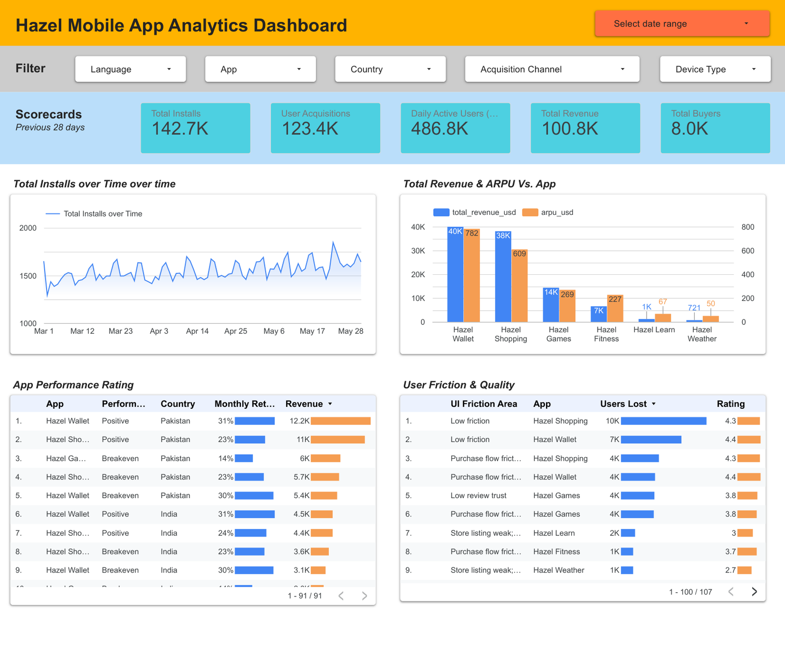
Case Study 3 — Mobile App Analytics Dashboard (Looker Studio)
The Problem
Hazel Mobile runs a portfolio of six apps across seven markets. Performance data was scattered across acquisition, engagement, revenue and app-quality reporting, with no single view. Leadership couldn't answer the question that actually matters for budget: which apps deserve more investment, which need fixing first, and why? Install counts alone were misleading — a high-install app can still lose money.
What I Built
A single interactive Looker Studio dashboard unifying the whole funnel — store listing through to revenue and app quality — with five slicers (Language, App, Country, Acquisition Channel, Device Type) plus a date range, so any stakeholder can self-serve an answer.
| Scorecard (28-day) | Value |
|---|---|
| Total installs | 142,711 |
| User acquisitions | 123,402 |
| Daily active users | 486.8K |
| Total revenue | $100,773 |
| Total buyers | 8,009 |
- Total installs over time — daily trend to spot campaign spikes and dips.
- Revenue & ARPU vs. app — combo chart exposing which apps monetise, not just which get downloads.
- App Performance Rating — ranked table (app · status · country · 30-day retention · revenue) with in-cell bars.
- User Friction & Quality — ranked table (friction area · app · users lost · rating) showing why users leave.
The Data
| Attribute | Detail |
|---|---|
| Rows / columns | 19,320 × 41 |
| Period | 1 Mar – 31 May 2026 |
| Apps | 6 (Shopping, Wallet, Games, Fitness, Learn, Weather) |
| Countries | 7 (PK, IN, UAE, SA, UK, US, BD) |
| Channels | 5 (Organic, Explore, Google Ads, Referrer, UTM) |
| Devices | Phone · Tablet · Wear OS |
The Data Architecture
The dashboard is designed to sit on a standard GCP analytics stack — the pipeline this dataset's schema was modelled on:
- Ingestion — app performance and monetisation data pulled via the Google Play Console API (installs, store-listing conversion, ratings, crash/ANR vitals), AdMob (ad revenue) and GA4 / Firebase (engagement, retention). In production this layer is owned by the data-engineering team, with the analyst defining the required fields and grain.
- Raw layer — landed as dated files in Google Cloud Storage (GCS) buckets.
- Clean & transform — processed in a Jupyter notebook on GCP: deduplication, type casting, schema validation, date normalisation, and the derived metric columns.
- Curated layer — loaded into BigQuery as analysis-ready tables.
- Reporting — Looker Studio connected directly to BigQuery, with the calculated fields and five filters layered on top.
The Techniques
- Calculated fields for decision-driving metrics: store-listing conversion %, ARPU, purchase conversion %, DAU/MAU stickiness, net install growth, repeat-buyer rate, and a quality-risk flag from crash/ANR thresholds.
- Combo charts on one shared entity (revenue bars + ARPU) so volume and value are read together.
- Ranked tables with in-cell bars — magnitude visible without reading every number.
- Cross-filtering across five dimensions so one dashboard answers many questions.
- Validation in Python (pandas) — recomputed every headline metric from the raw file; installs, acquisitions, revenue and buyers all reconciled exactly to the dashboard.
The Insight — technical quality predicts monetisation
| App | Revenue | ARPU | 30-day retention | Crash rate | Rating |
|---|---|---|---|---|---|
| Hazel Wallet | $39,930 | 0.24 | 29.8% | 0.64% | 4.39 |
| Hazel Shopping | $38,065 | 0.19 | 23.1% | 0.68% | 4.25 |
| Hazel Games | $14,334 | 0.08 | 13.6% | 1.16% | 3.76 |
| Hazel Fitness | $6,544 | 0.07 | 15.4% | 1.27% | 3.64 |
| Hazel Learn | $1,178 | 0.02 | 7.7% | 2.08% | 3.04 |
| Hazel Weather | $721 | 0.02 | 6.7% | 2.48% | 2.74 |
- The two apps with the lowest crash rates and highest ratings produce 77% of all revenue and hold 3–4× the 30-day retention of the weakest apps.
- The bottom four apps absorb ~47% of installs but return only ~23% of revenue — acquisition spend is leaking into a weak product.
- Crash rate tracks retention almost monotonically (0.64% → 29.8% retention vs. 2.48% → 6.7%), so the order is quality first, spend second.
- Purchase-flow friction is the most common friction area — checkout is the highest-value UX fix.
The Recommendation
| Tier | Apps | Action |
|---|---|---|
| Scale | Wallet, Shopping | Strong retention, rating and ARPU — increase acquisition budget. |
| Test further | Games, Fitness | Mid-tier economics — A/B test onboarding and purchase flow before scaling. |
| Fix / reconsider | Learn, Weather | Crash rates 3–4× the best apps, ratings below 3.1 — stabilise quality before more spend. |
What's in this case study
- Dashboard screenshot — the live report: scorecards, trend, revenue/ARPU combo and both ranked tables.
- Dashboard PDF — the full-resolution export.